THE San francisco opera
APP REDESIGN PROJECT
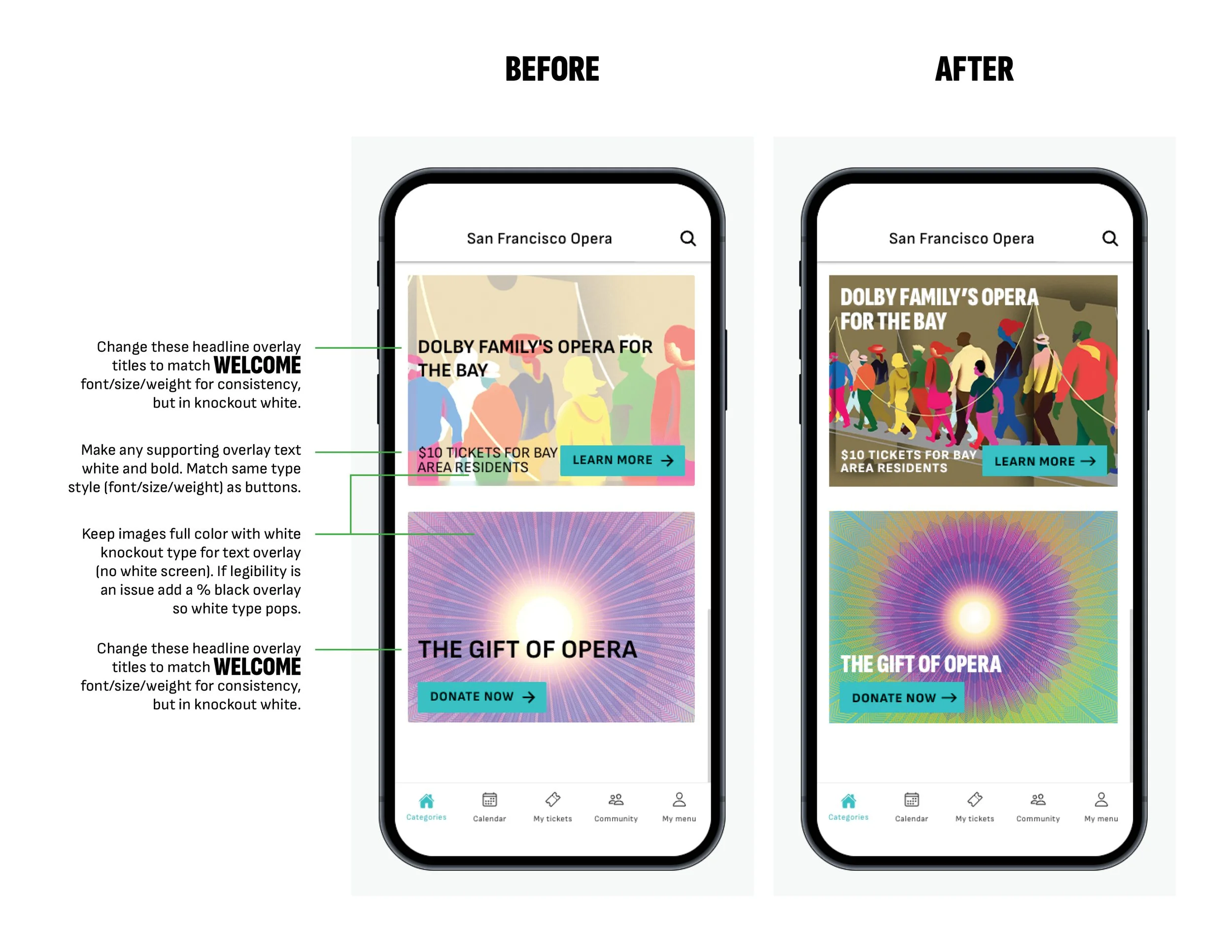
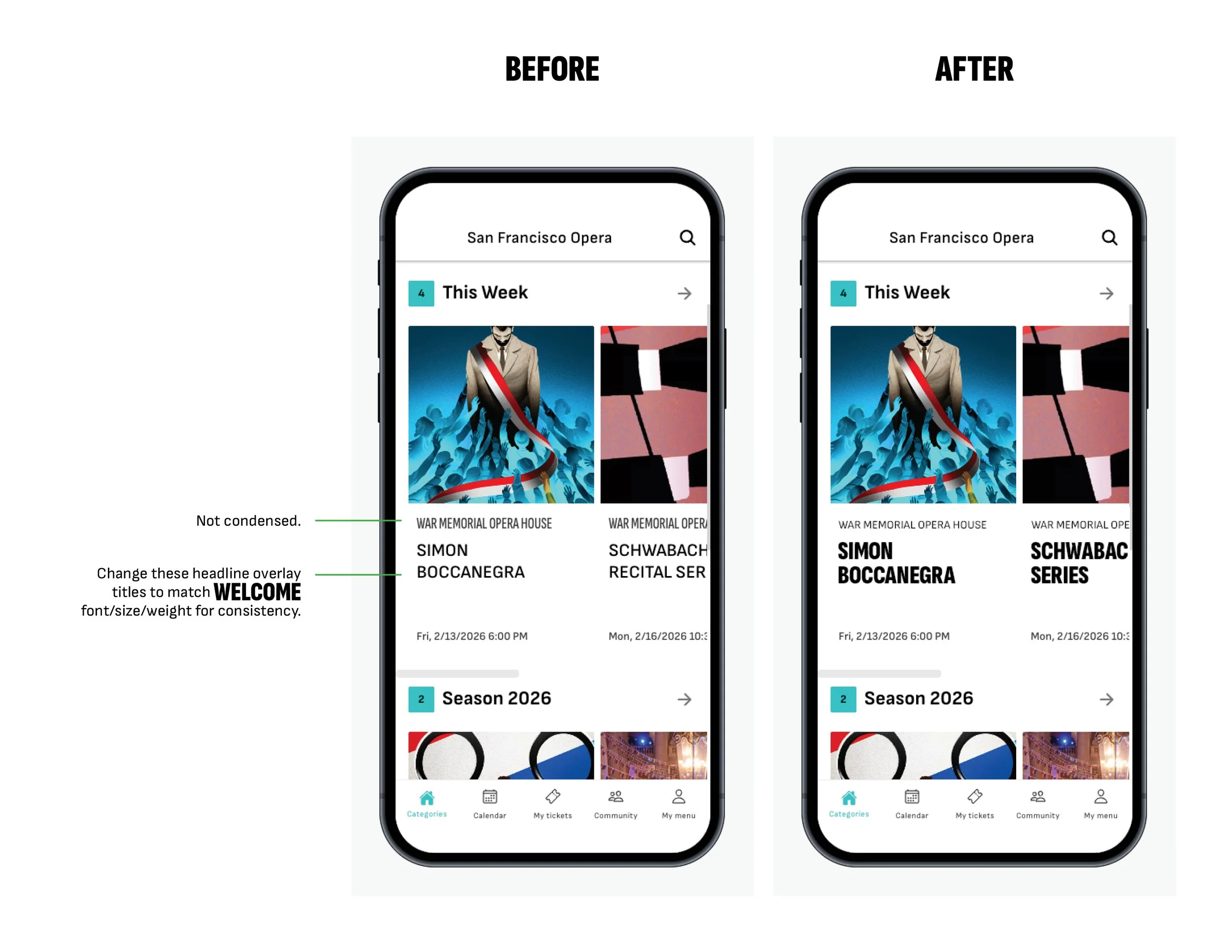
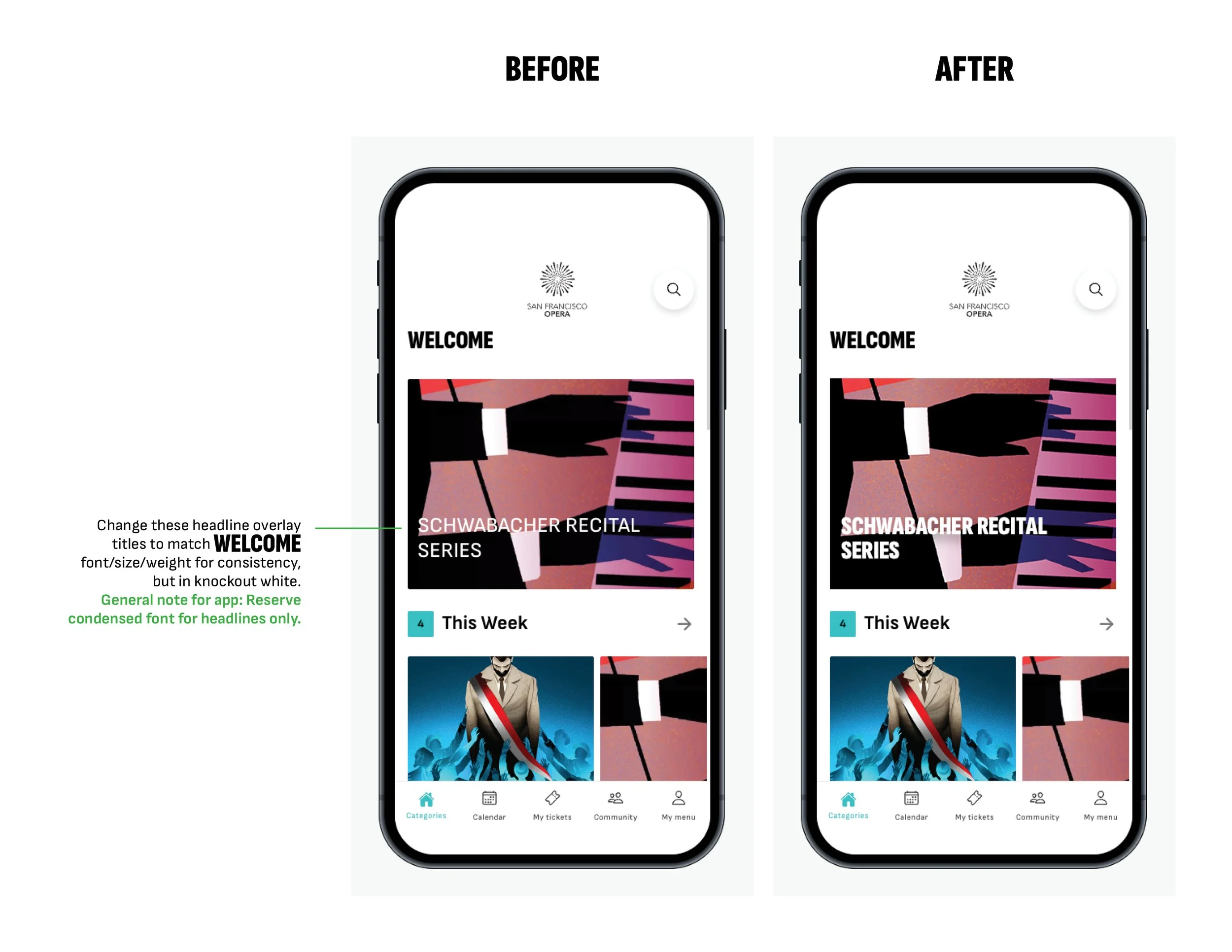
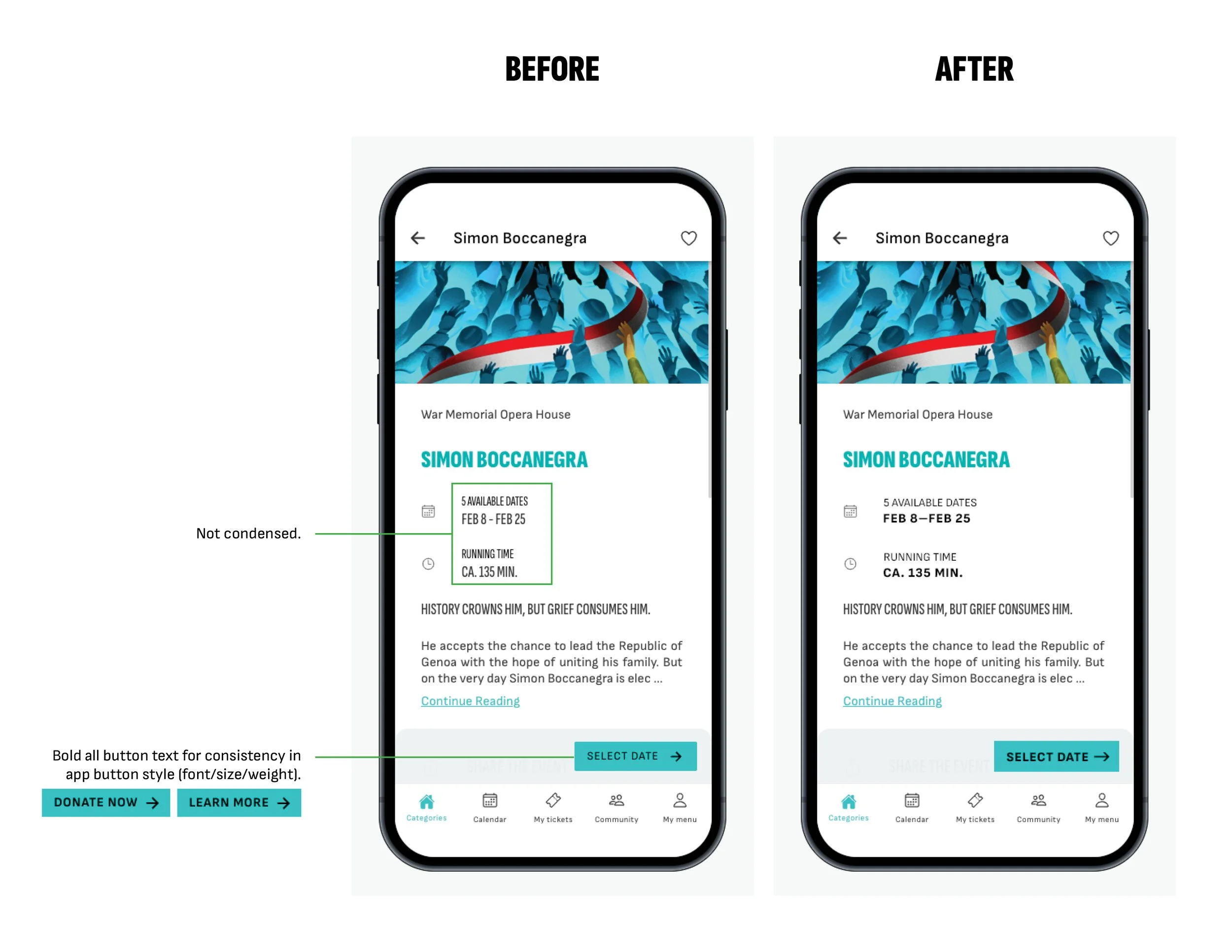
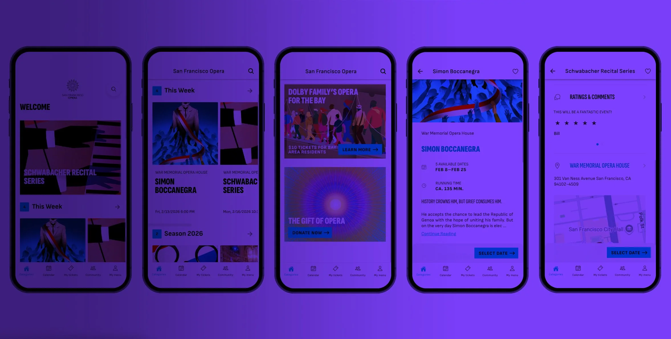
A visual redesign to bring the San Francisco Opera app into alignment with its new brand style and strengthen user navigation. I established a cohesive typographic hierarchy, refined the treatment of image-led content with bold knockout typography on full-colour images, and introduced greater consistency across headlines, supporting text, and interface elements. The result is a more consistent, intuitive experience that turns visual storytelling into a clearer path to conversion.